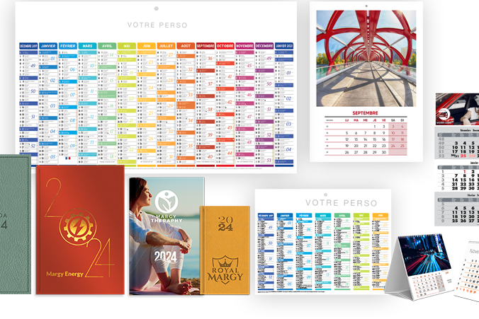
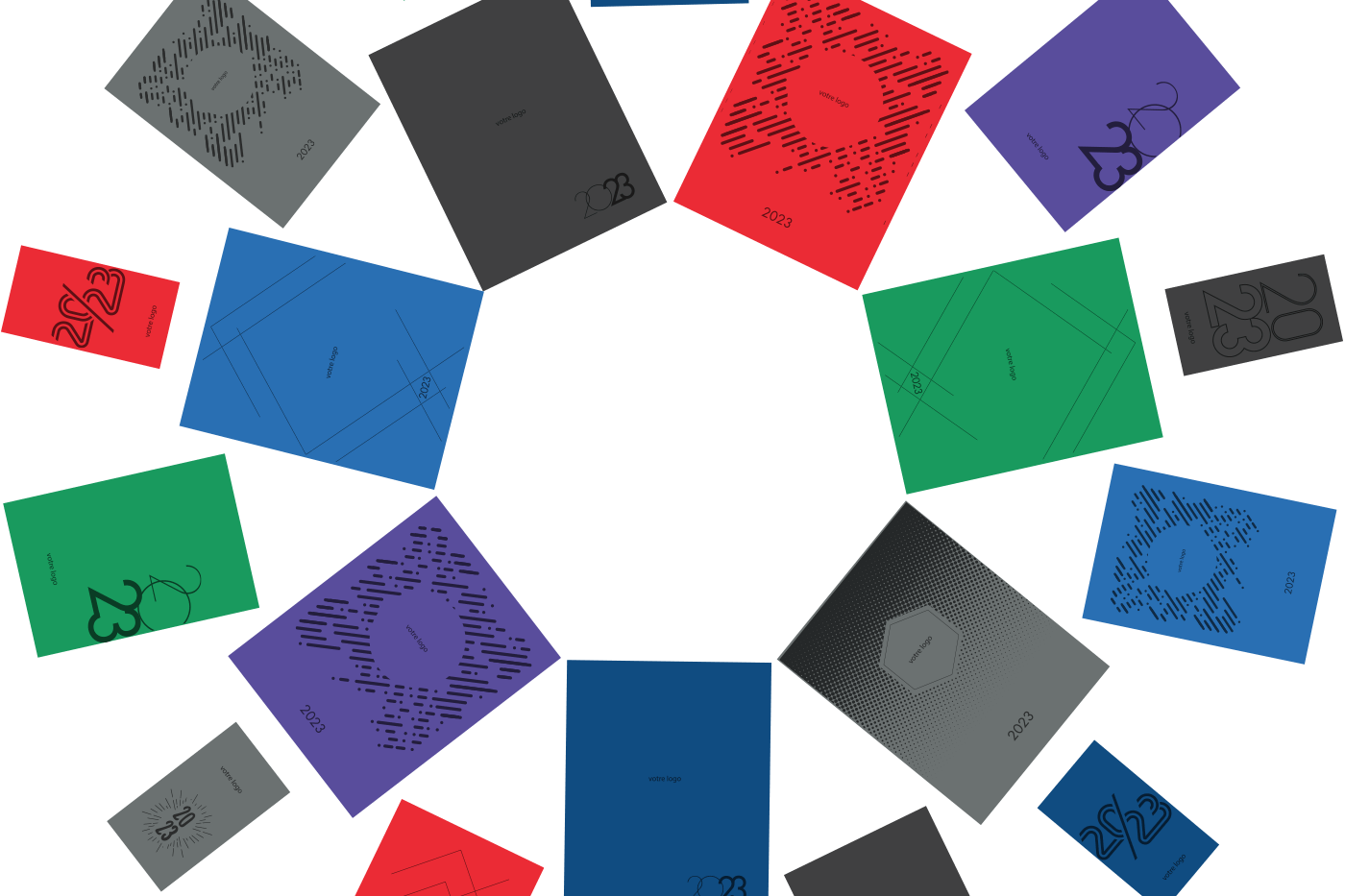
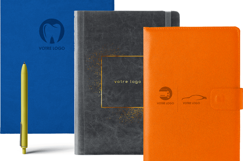
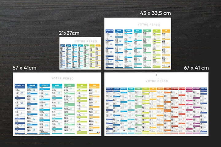
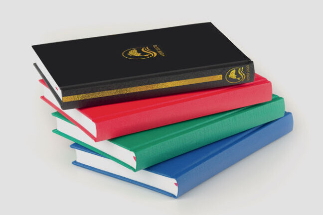
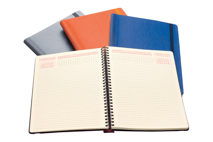
The Zulma publishing house is characterised by its colourful covers and graphics. The covers are instantly recognisable and are both singular and accessible. The person responsible for these works of art is a talented and ingenious graphic designer.

Covers as works of art

The geometric motifs, colours and inverted triangles are the key to the success of Zulma’s covers. An inspiration which comes straight from the Penguin publishing house during the 1950’s and the German publisher, Insel verlag.

The publisher chooses, in effect, to utilise very graphic and iconic motifs for their covers. Circles, triangles, straight lines and stars are combined to produce a symmetrical cover.

Colours are also well represented and very much present. They are sometimes bright, flashy or even pastel but more discrete. The colours are in total harmony with the chosen design. The combination of the graphics and the colours is always well thought out.

Not forgetting the inverted triangle on a white background, geometrically formed and centrally positioned; something that all the covers have in common. Located near the top of the cover, it bears the name of the author, the title of the book and the initial “Z” for the publisher’s name. Each book has its own typography which corresponds to the book’s identity and its contents.

The striking combination of all these elements can be compared to a work of abstract art.

The work of an English artist

David Pearson, the Englishman behind these covers is a graphic designer. Laura Leroy, the director of the publishing house crossed the channel herself to ascertain the graphic designer’s savoir-faire. She had already admired the earlier work of the artist, especially for Penguin Publishers. Pearson accepted to propose drafts to Zulma’s director, who gave her opinion and instructions for any changes. The two protagonists worked in concert to produce cover models as extravagant as they are special.

A singular graphic design

The graphic designer, David Pearson, and the director of the publishing house, Laura Leroy, wanted to establish a unique graphic design for Zulma. This blend of graphic forms, colours and typographic choices has given birth to a unique visual identity . The published books may be all different but are still recognisable as productions from the same publishing house. This is exactly what the publishing house wanted, a way of distinguishing the company from other publishers and imposing its own design. Zulma books are instantly recognisable in bookshops thanks to their unique design. The visual identity of a company is primordial for its marketing communication and influence. It contributes to its success and its personality. Zulma, with its distinguished and atypical graphic choices, has succeeded in forging a strong image.

The impressions Margy Consultants propose their publishing know-how to companies and individuals for their advertising supports. Books, sales brochures, magazines, flyers as well as numerous paper supports can be adapted to the needs of each profile. Communication by way of image which accords each company an optimal visibility.


Other posts: